BRANDING
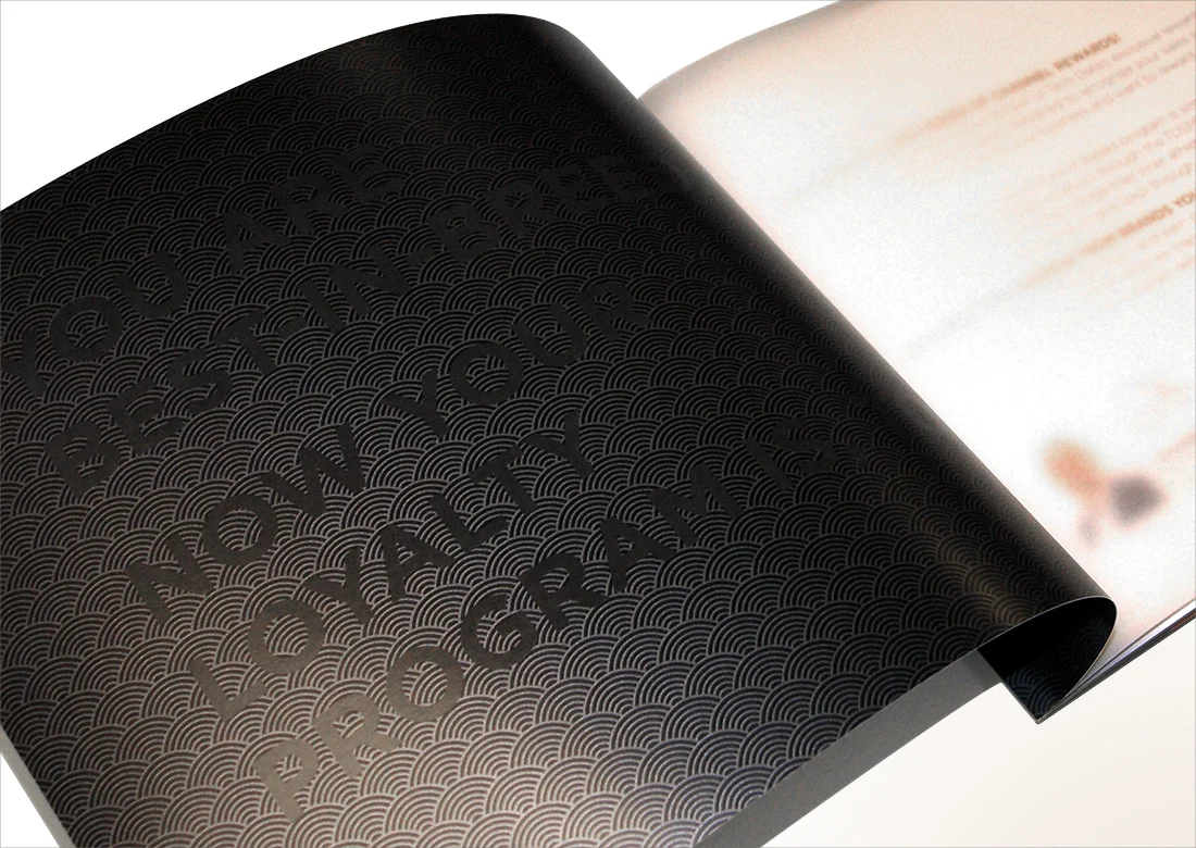
Tech Data’s Loyalty Rewards program explainer brochure targeting mid- to large-scale IT resellers. Print production techniques included metallic foil on the cover, metallic ink on inside pages, clear varnish on section headlines and vellum sheets as section dividers.
Client: Tech Data — now TD Synnex | Credits: Creative direction, art direction, print direction, graphic design, copywriting


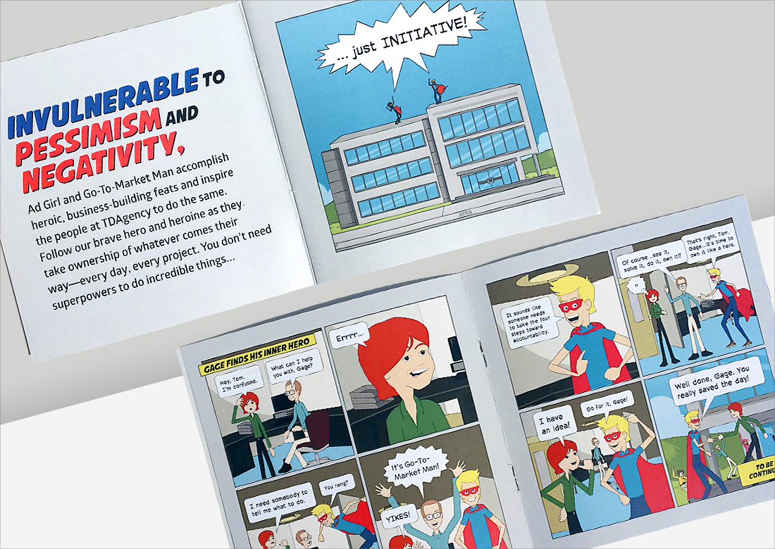
This internal agency campaign used a tongue-in-cheek approach plus no-frills photography and comic art to strike a chord with team members in order to motivate them to apply a higher degree of ownership/accountability throughout projects across the organization.
Client: Tech Data — now TD Synnex | Credits: Art direction, graphic design


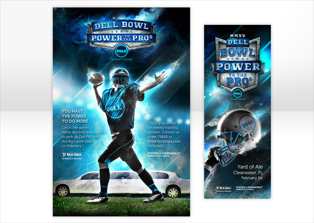
Print, digital and environmental for an internal promotional campaign. The winner of the highest sales of Dell products was awarded VIP passes to Tech Data’s Dell Bowl ⏤ a sales-incentive program. Limousine service was included as part of the award.
Client: Tech Data — now TD Synnex | Credits: Creative direction, art direction, graphic design


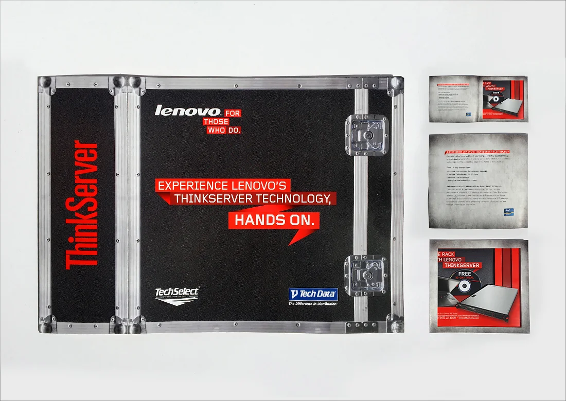
Three-dimensional direct mailer urging CIOs and CTOs to arm their sales force with Lenovo’s Thinkservers products. The CTA pushed for them to order a risk-free, 10-day trial of the server demo kit for their sales team to use in customer pitch meetings.
Client: Tech Data — now TD Synnex | Credits: Creative direction, art direction, graphic design, copywriting


Direct mailer targeting technology resellers. The goal was sales conversion of Cisco Services that resellers could then upsell to their customer. The mailer urged the audience to visit the “Meet the Moores” website and employed an advent-calendar type device to intrigue customers as to how the campaign related to the technology services offered by Cisco.
Client: Cisco | Credits: Art direction, graphic design


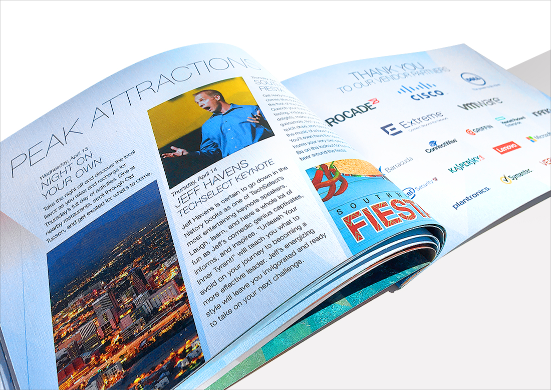
Elegant conference agenda for top-growth technology provider customers. The theme “Partnering for Peak Performance” reflected the mountainous environment in which the conference took place, Tucson, AZ. Print production techniques included tape binding using a strip of cloth fabric, a die-cut silk cover and vellum sheets as section dividers.
Client: Tech Data — now TD Synnex | Credits: Creative direction, art direction, print direction


Digital internal agency newsletter highlighting quarterly wins and employee celebrations.
Client: Tech Data — now TD Synnex | Credits: Art direction, graphic design


Holiday self-mailer promoting Lenovo client devices to technology solution providers. Print production included a snowflake-inspired die cut and clear varnish finish to accentuate the products on promotion.
Client: Lenovo | Credits: Creative direction, art direction, print direction, graphic design


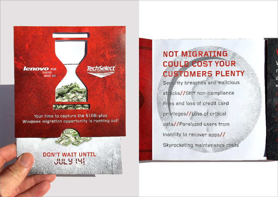
Time-sensitive 3D mailer aimed at Lenovo technology resellers. I utilized a die cut of an hourglass to convey the time-sensitive nature of potential income loss.
Client: Lenovo | Credits: Art direction, print direction, graphic design, copywriting